UX/UI Design | Mobile Web | 2026
A box that makes deciding a little easier
For every “I don’t know”
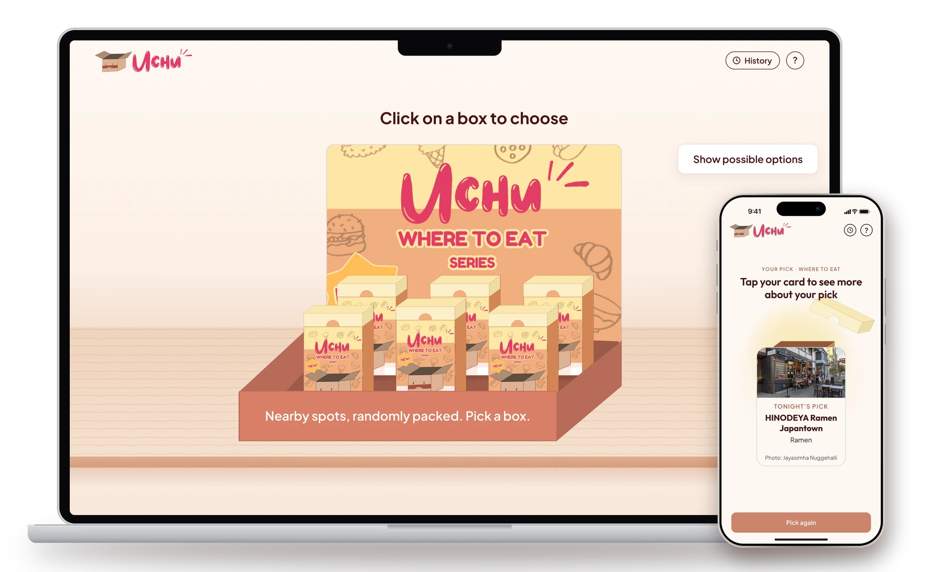
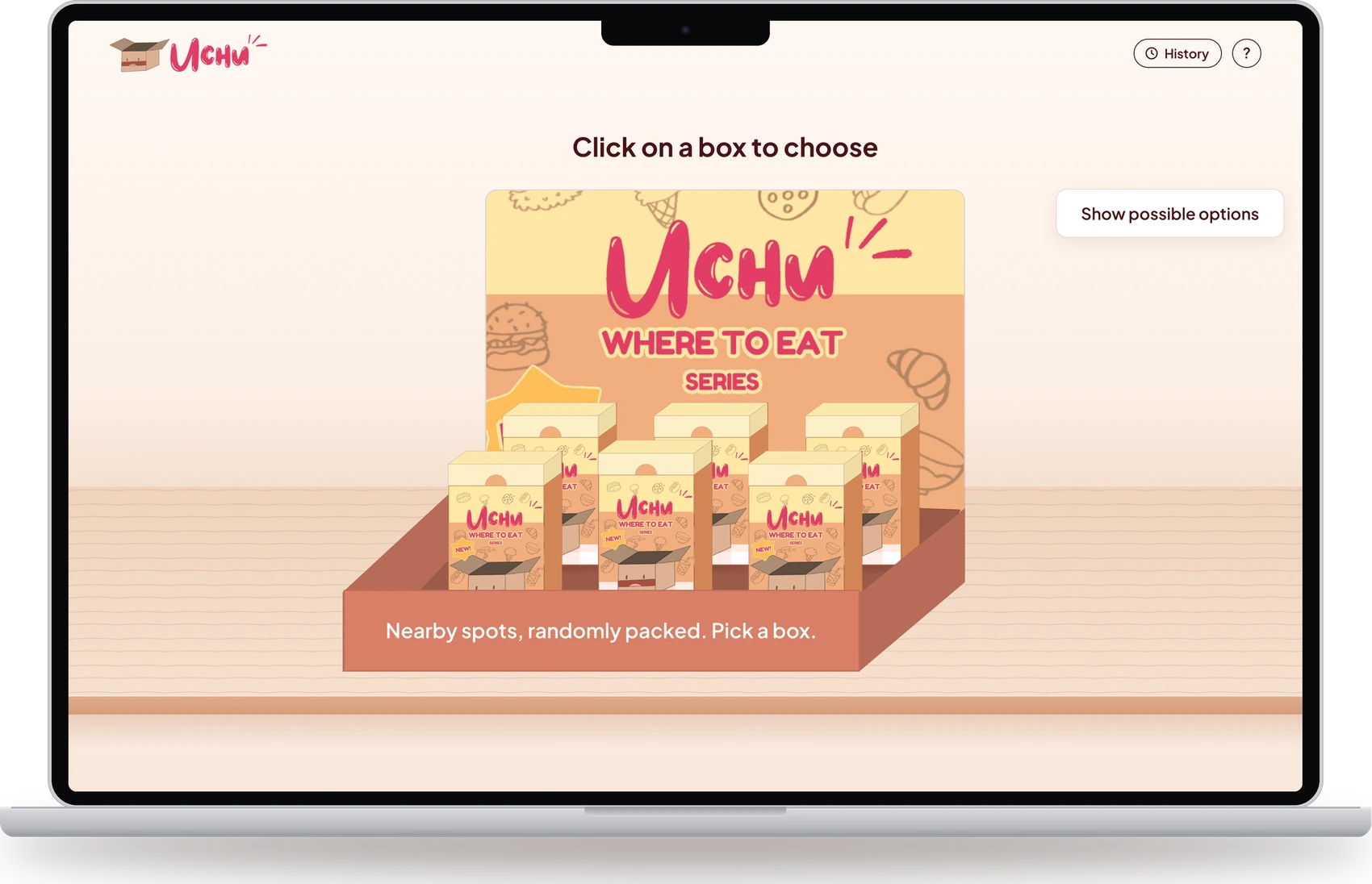
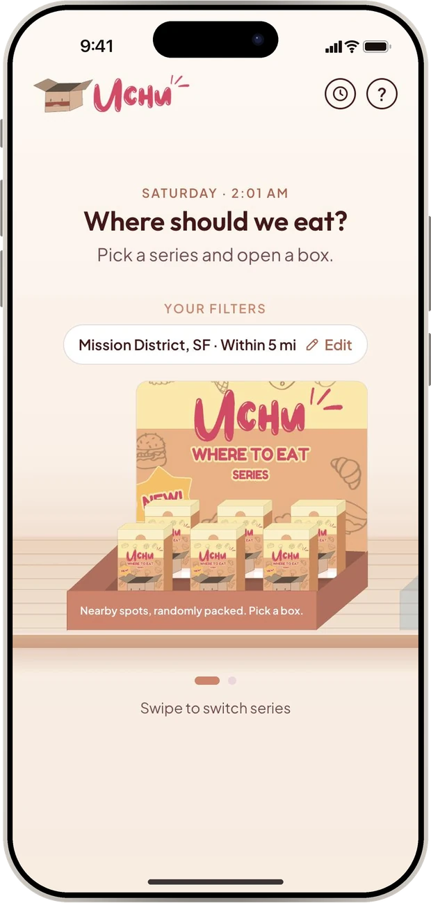
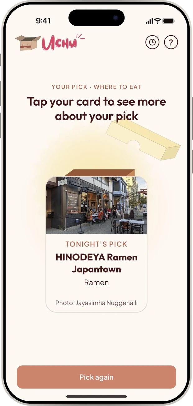
Uchu turns “I don’t know, you choose” into a blind box you open together, using randomness to help you find what you actually wanted.
Role
UX/UI Designer
Tools & Skills
Figma, User Research, Usability Testing, Prototyping, AI-assisted Iteration
Duration
About 2 months
Overview
Deciding dinner shouldn’t take 20 minutes of “you pick”
Deciding what to eat stalls because everyone defers. One person suggests something, everyone agrees, someone suggests something else, and the group circles until tension builds. Three of the five people I interviewed say they’re OK with anything about 90% of the time.
Uchu is a mobile site that packs nearby restaurants into blind boxes. Set your filters once, take out what you’re not feeling, and open a box. No sign-in, no endless scrolling.
It’s already in use by over 50 students at the University of Illinois Urbana-Champaign and Rutgers.
Final Product
Meet Uchu — Dinner, Decided by a Blind Box
View the live projectA mobile site that turns “I don’t know” into a quick, playful reveal you can trust.

Key Features
Filters Once, Then Forget Them
Set location, diet, budget, distance and lowest rating once. A summary pill stays on the home screen, so every box already fits your table.
Eliminate, Don’t Choose
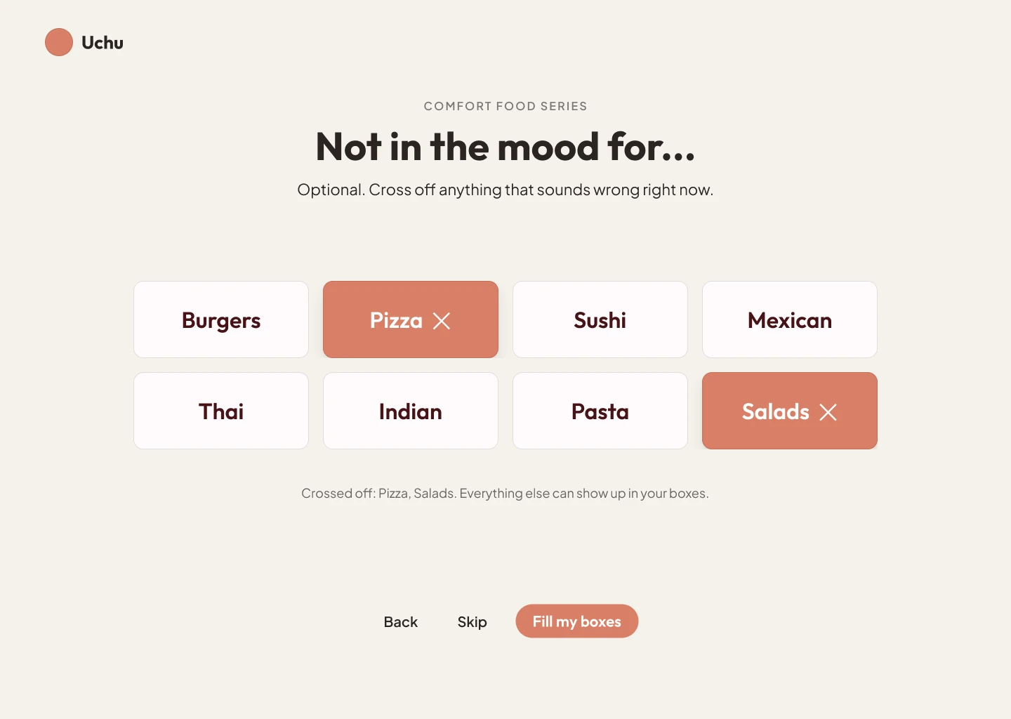
Instead of picking a cuisine, users take out what they’re not feeling. They can preview all 6 possible picks without knowing which box holds which.
A Reveal Worth Tapping
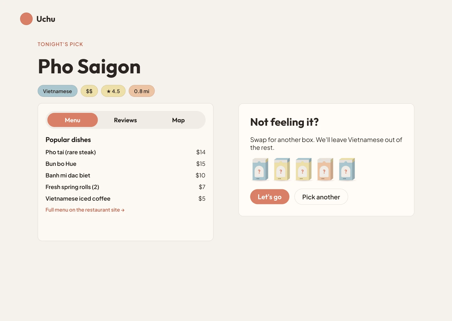
Series sit on a collectible shelf. Tap a box to select it, tap again to open it, and a card pops out with tonight’s pick.
Proof Before You Go
Every result shows rating, distance, hours, menu, reviews and a map. Not feeling it? Swap the pick, with 2 re-rolls a night so the box still means something.
Process · Discover
How might we help indecisive groups pick a meal without anyone feeling responsible for a bad choice?
I interviewed 5 young adults about deciding what to eat alone and in groups, and how they’d feel about a blind box picking for them.
~90%
How often 3 of 5 interviewees say they’re OK with anything
20 min
A typical group dinner decision, by 2 interviewees’ estimates
4 of 5
Wanted to swap one pick instead of re-spinning everything
Groups raise the stakes.
3 of 5 said a bad random pick hurts more in a group.
Trust needs proof.
Menu, ratings and distance must show before anyone commits.
People know what they don’t want, even when they can’t say what they do.
Vetoes should be surgical:
swap one pick out instead of re-spinning everything.
I designed Uchu for undecided moments, then distilled the interviews into three personas.
Passive Compromiser
Maya Lin
21 · University student · Eats out with friends most weekends
“I honestly don’t mind. Wherever everyone else wants to go is fine.”
Maya goes along with whatever the group lands on. She isn’t indifferent. She’s worried that stating a preference will start a debate or leave someone feeling overruled, so she keeps her opinion to herself and hopes someone else decides.
Goals
- Keep the group relaxed and avoid any awkwardness
- End up somewhere nobody dislikes
- Never be the person blamed for a bad pick
Frustrations
- Gets handed “you choose” and freezes
- Feels guilty if her pick turns out badly for others
- Often realizes later she did want something specific
How they decide today
Says “anything is fine,” waits for the group chat to settle, then agrees to the first idea that doesn’t get pushback.
Decision driver
Group harmony and peace
What Uchu gives them
Takes the pressure off and makes choosing fun. The box takes the blame, so nobody has to.
Pragmatic Organizer
Marcus Vance
24 · Graduate student · Usually the one who ends up planning dinner
“Just give me a few good options and let’s go. We’ve been standing here for twenty minutes.”
Marcus is the friend who ends up running the group dinner and watching the clock. He has hard limits on budget, distance and what everyone can eat, and he gets frustrated when a decision drags on or restarts every time one person says no.
Goals
- Decide quickly, within the group’s budget and distance
- Respect dietary needs without a long back-and-forth
- Get everyone seated while they’re still hungry and happy
Frustrations
- Time lost to circling and stalling
- Too many tabs, lists and opinions to compare
- Having to start over when one person vetoes
How they decide today
Filters a maps app, proposes one place, and negotiates until the group stops objecting.
Decision driver
Efficiency and strict constraints
What Uchu gives them
A fast, filtered tie-breaker. Set filters once, and swap a single pick without re-spinning everything.
Analytical Researcher
Jean Abrams
27 · Young professional · Reads reviews before trying anywhere new
“I’m happy to try something new, as long as I can see it’s actually good.”
Jean treats dinner like a small investment. She checks ratings, scans the menu and looks at the distance before agreeing to anywhere, and she’d rather skip a place than waste money on a bad meal. A blind pick only works for her if she can verify it afterwards.
Goals
- Spend money only on food that’s worth it
- See rating, menu and distance before committing
- Still discover places she wouldn’t have searched for
Frustrations
- Paying for a disappointing meal
- Random pickers that ignore quality
- Picks that arrive with no proof or detail
How they decide today
Compares ratings and reviews across apps, shortlists two or three places, then asks friends for a final vote.
Decision driver
Quality, ratings and value
What Uchu gives them
Mystery picks that meet a quality bar, with rating, menu, hours and a map shown before she commits.
Ideation
User Flow
01
Set your filters once
02
Swipe to pick a series
03
Take out what you’re not feeling
04
Pick a box from the shelf
05
Tap twice to open it
06
Check the menu, reviews and map
Lo-fi and Mid-Fi Wireframes
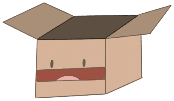
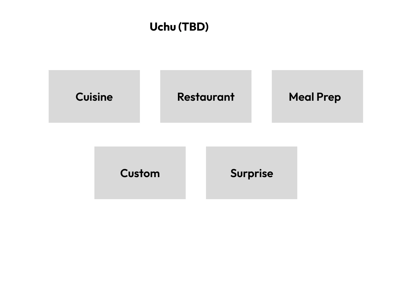
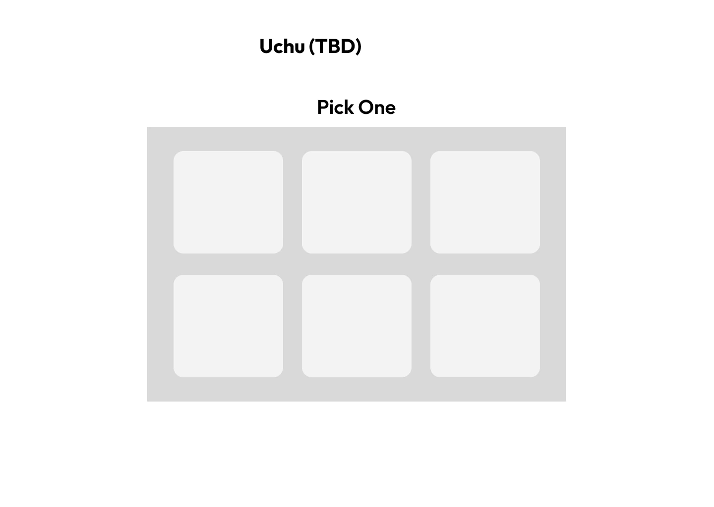
I sketched the core flow as lo-fi wireframes, then used AI to apply my palette and generate first mid-fi flows. I designed the final components myself, including the blind box and display shelf.
Color Palette & Logo
Cream
#FFF8F2
Butter
#FBE8AD
Peach
#F2AE7E
Terracotta
#D97F66
Mauve
#7A4A50
Cocoa
#471317
Font used
Aa Uchu
Outfit — headings
What are we eating tonight?
Plus Jakarta Sans — body
Logo

Process · Testing
I tested the first build with more than 20 people across New Jersey, New York, Chicago, Champaign and California. Most found it cute and easy to use, but many missed the filters and the series choice.
What testers struggled with
What I changed
Overlooked the filters
Changed:Made filter editing more obvious and added a how-it-works popup on first visit
Didn’t realize they should pick a series
Changed:Added a label above the series boxes and a short description of each
Skipped the “not in the mood” step
Changed:Gave it more emphasis on the screen
A filter above Build Your Own confused people
Changed:Removed it
Opening a box felt flat on mobile
Changed:Added tap-to-open for a more tactile reveal
Text was hard to read and the home screen felt static
Changed:Increased text size and added rotating headlines
Reflection
What building this taught me
Uchu was my own end-to-end design process, from the first interviews to a working product, for a tool I genuinely thought people would use. Almost everyone struggles to make decisions, especially in a group where nobody wants to be the one who picks. I wanted to bring a hobby that so many people love into that stressful moment, so decision making feels like opening a surprise instead of a negotiation.
Uchu works because it lowers the stakes of choosing, not because it chooses for you.
How I used AI
I used AI throughout Uchu, and a big part of the project was learning how to use it well. I learned how to prompt: describing what I wanted clearly, giving it my palette and constraints, and iterating on what came back instead of accepting the first result. I used it to apply my palette to my lo-fi sketches, to generate first mid-fi flows, and to build the site. Wherever the output wasn’t right, I made the adjustments myself, and the parts that carry the product’s personality, the blind box and the display shelf, I designed by hand.
What I’d do differently
I interviewed five young adults, so my personas lean toward people like me. Next time I’d talk to a wider range of people earlier, including people who rarely struggle to decide, so I’d learn sooner where a blind box doesn’t fit. I’d also put the first build in front of a real group deciding together, since that group moment is exactly what Uchu is built for.
Looking ahead
I think Uchu would be most useful as a feature inside a product people already lean on to find somewhere to eat, like Beli or Google Maps. People already open those apps for restaurant recommendations in an area, and Uchu could be there for the moment a group can’t agree and wants the decision to feel fun and low-stakes.
The idea isn’t limited to food. The same pattern, taking out what you don’t want, letting a blind box pick from what’s left, and showing enough detail to trust the pick before you commit, could apply to almost any decision people get stuck on: what movie to watch, where to travel, what to do on a weekend, or what to get someone as a gift. Anywhere a group says “I don’t know, you choose,” a box could take the pressure off and make the decision fun.